JMEK DESIGNBRANDING AGENCY
WE CREATE STRONG BRANDS
We develop and support brands. We study markets and consumers, check hypotheses, and find perspective market niches. We do intelligent design, architecture of buildings and public spaces. We start and accompany projects. Our complex approach and accurate sequence of works lead to the creation of demanded products and strong brands.
Principles of work
Everything begins with a meeting when we find out true business objectives of the project. The client does not fill out a brief, on the contrary, the agency constitutes understanding of a task. This document expertly describes what is necessary to do in a concrete situation. It is free. It is possible to realize an offered plan by yourselves if the company has got competent specialists for this purpose.
We work according to the marketing algorithm from the consumer. Each conclusion logically relies on the previous stages. We always have the only completely reasonable decision.
The process of performance of works is transparent for our client at any time: delivery and approval of results occur weekly. The service cost is always open and clear.
We understand that there are no ideal projects and conditions, therefore we are able to respond in a timely fashion to any problems. We bring our work to a resulting effect. The technologies of Fix Time, Fix Bubget, Fix Scope are used for this purpose. Work will be done in time and without any increase in the budget.

The work of the agency is divided into stages and gathers together as modules do. At the end of each stage, the protection of result is carried out in the form of the presentation for the client. After the client approves the result, we reach the point of no return. It means that the received conclusions are completely admitted by the parties and form the basis of work of the following stage.
The whole cycle of branding is not always required. It depends on the revealed business challenge when it is possible to move to independent stages. The structure of works is described in understanding of a task. Each stage takes from 1 to 3 weeks. The structure of works and terms are affirmed in the form of a schedule and remain invariable till the commissioning of the project.
Market Strategy
The stage of the development of a product or brand. It makes no sense to shift to the development of graphics, logo, and communication without it.
MRMarket Research
We study capacity and shares of the potential market. MR helps us estimate risks, understand what niche it is profitable to work in.
CRConsumer Research
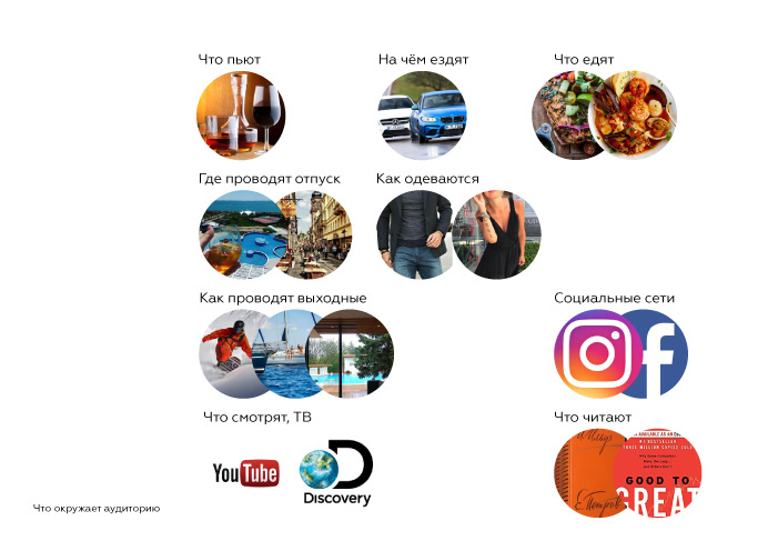
CR finds and describes the target audience. It creates requirements to a product which will be demanded by people
BPBrand Pyramid
BP determines brand values and provides guidance for business. It includes a value proposition and plan of implementation.
Brand Identification
The creation of visual language which the brand uses to communicate with its consumers. General rules for all communication channels.
NANaming
The development of the name which corresponds to a brand pyramid. The unique name which is checked for purity.
IDIdentity
The complex solution of the corporate style of a company or product. Logo, colours, typography, graphics, and multisensorics.
ARArchitecture
Exterior and interior design concepts of a commercial real estate correspond to the strategy of the company.
Implementation and Control
The brand launch, work on achieving the established business indicators. Supervision of production, building and design.
DEDesign
The plan of interaction with the consumer. Necessary channels of promotion and content type at all stages of the project.
SCStrategy of Communications
The production of prototypes according to the communication plan, following the rules of identity and brand pyramid.
MAMaintenance
The control of execution of key rules of a brand. Production of printing, external, and presentation products.
RESIDENTIAL REAL ESTATE
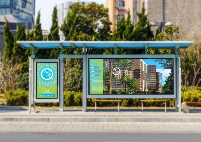
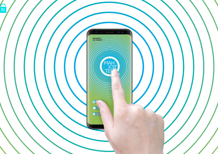
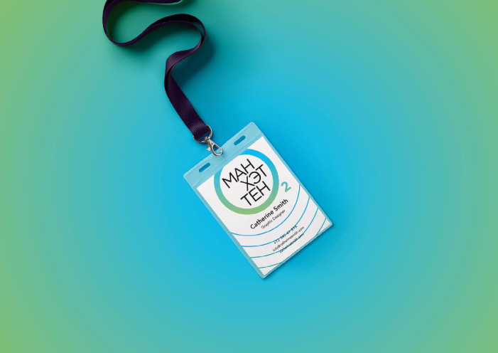
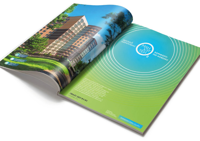
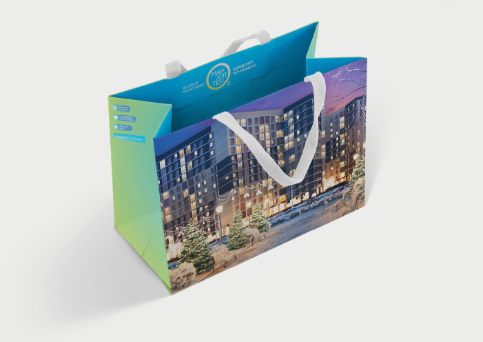
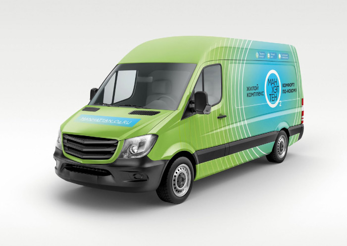
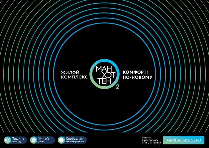
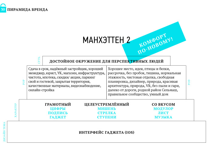
Manhattan o2
Task
RRE of Business class sold apartments from the 1st queue and appealed to start the second one in simpler Comfort class of housing. It was necessary to detach from competitors, designate a difference between queues, but keep succession, prepare for an advertizing campaign.
What Has Been Done
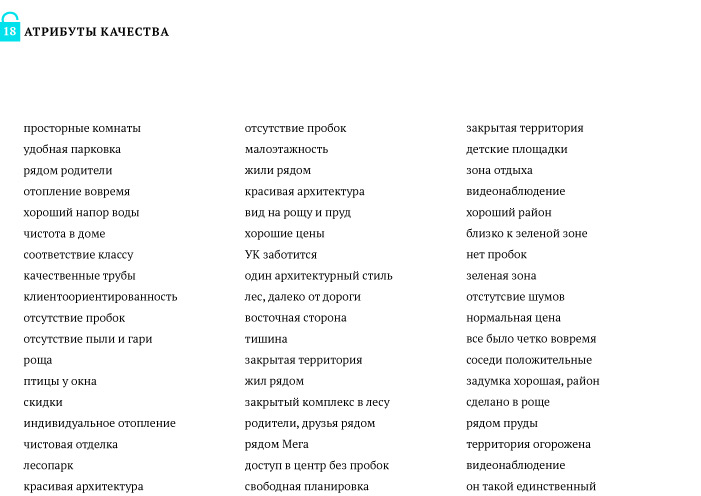
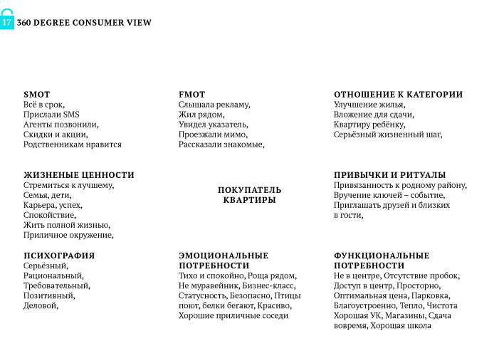
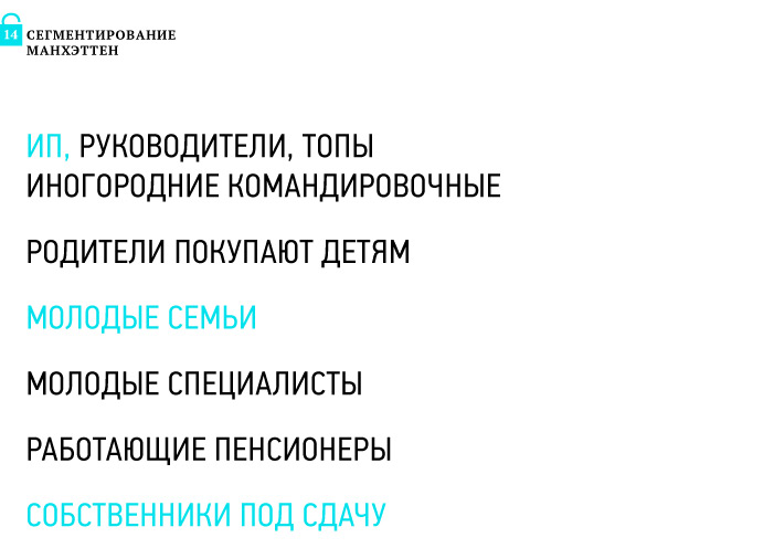
We have studied residents of the first queue and determined a difference with future buyers. The consumer pays attention to all classes of housing, from house-keeper to premium. We have learned about attachment to the area, its portrait and habitat. We have found out that our consumers are modern, hardworking, and aiming at more
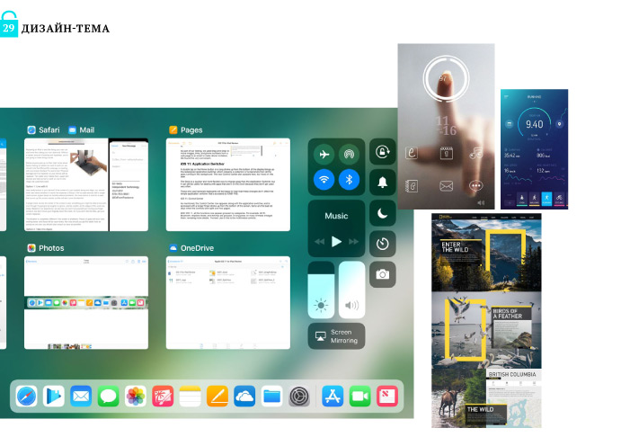
We have studied competitors of all classes and also their positioning and value propositions. We have prepositioned a new queue of RRE as a worthy environment for perspective people. We have added the smart house and VR to the basic attributes. We have chosen the character of the brand: competent, purposeful, and with taste. We have picked up a design subject: IOS Gadget Interface.
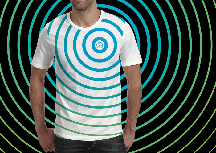
We have corrected a naming. On keeping the name of the Manhattan complex, we have introduced the O2 prefix as fresh air, in support of ecological compatibility both natural and emotional, with the perspective of the 3rd queue – O3. Moreover, the letter O is good as a symbol of surrounding, that has been reflected in the identity.
We have developed the identity, using gradients and elements, conformable with IOS. We have constituted the content for the whole product. We have developed 3D models of RRE, environment and interiors of apartments. We have chosen modern offering of apartments through 3D models in the VR format. We have made the design of communication materials and started an advertizing campaign.

We know how to make brands
for any property:
residential complexes, towns, cities.
leave a request
PUBLIC CATERING
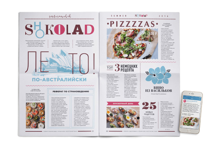
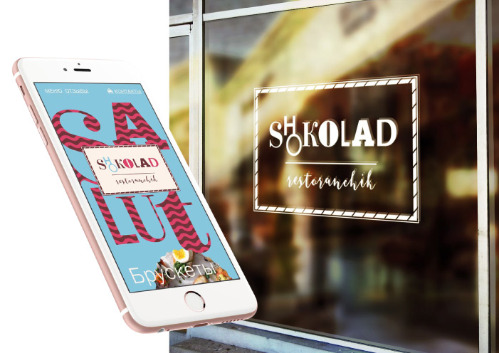
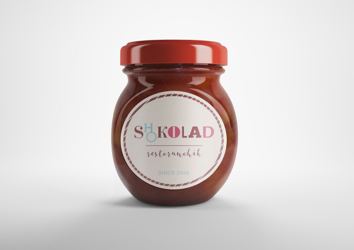
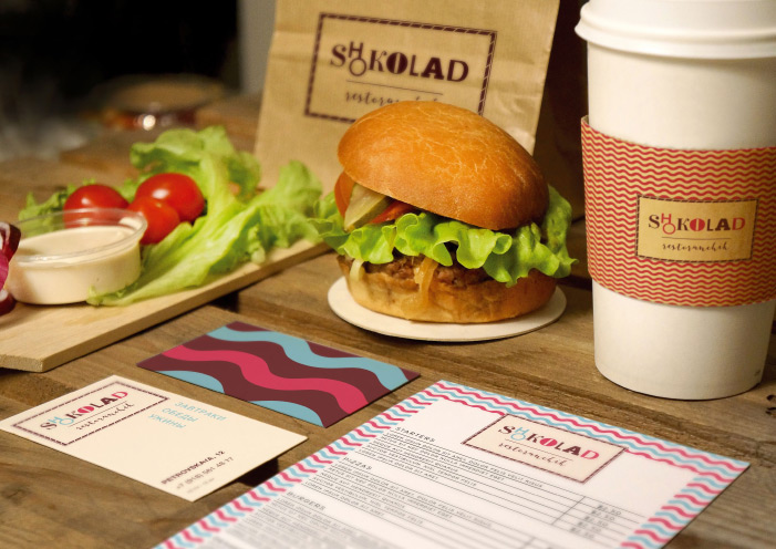
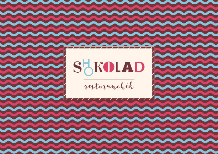
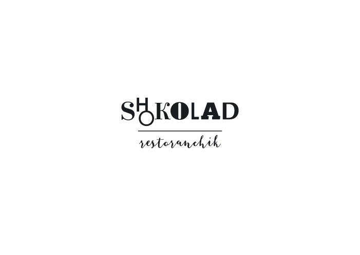
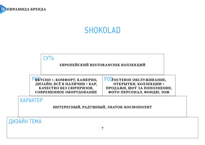
Restoranchik Shokolad
Task
Cafe in Taganrog needed to increase attendance and revenue. Restaurant service, European interior, antiques, complex menu, large wine list, affordable prices, but there is lack of visitors.
What Has Been Done
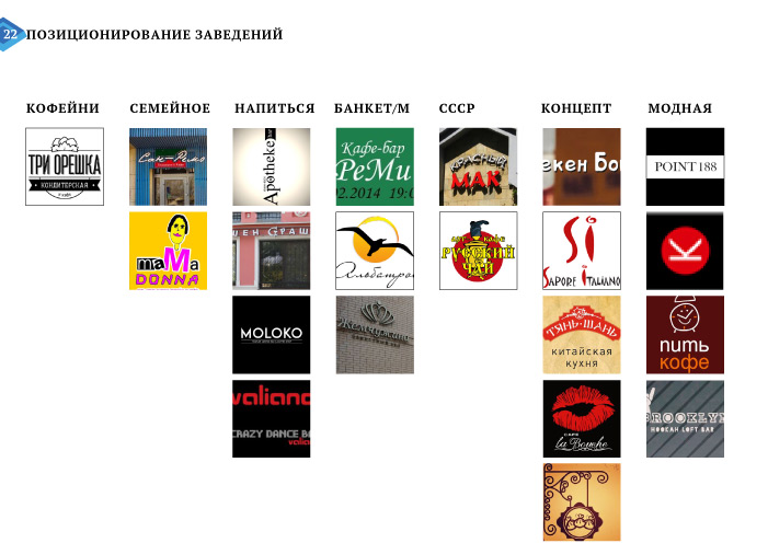
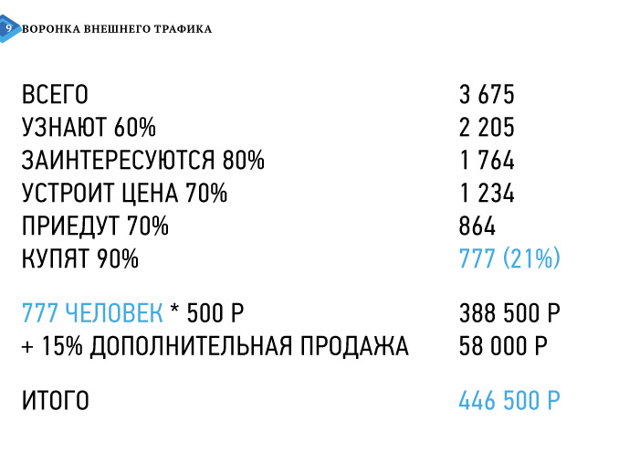
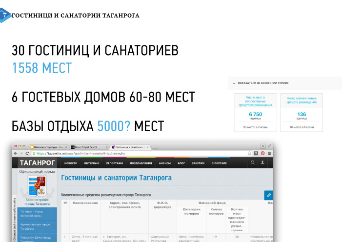
We have studied the market of public catering of Taganrog, understood its market capacity and the success of the main competitor.
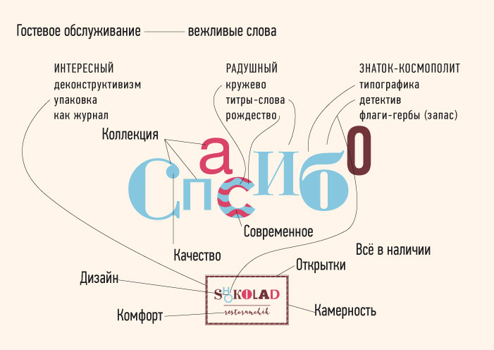
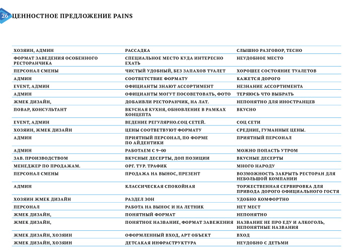
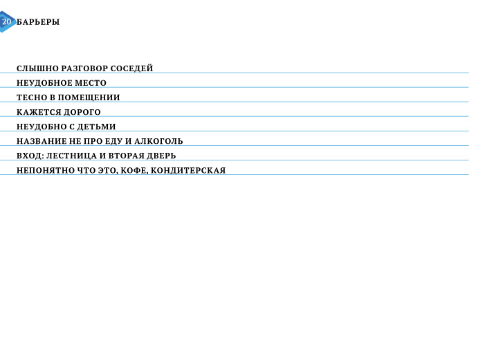
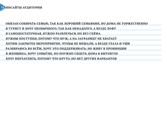
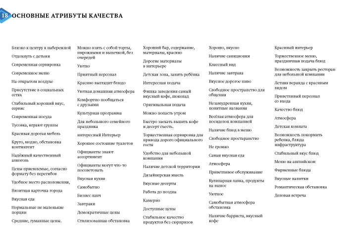
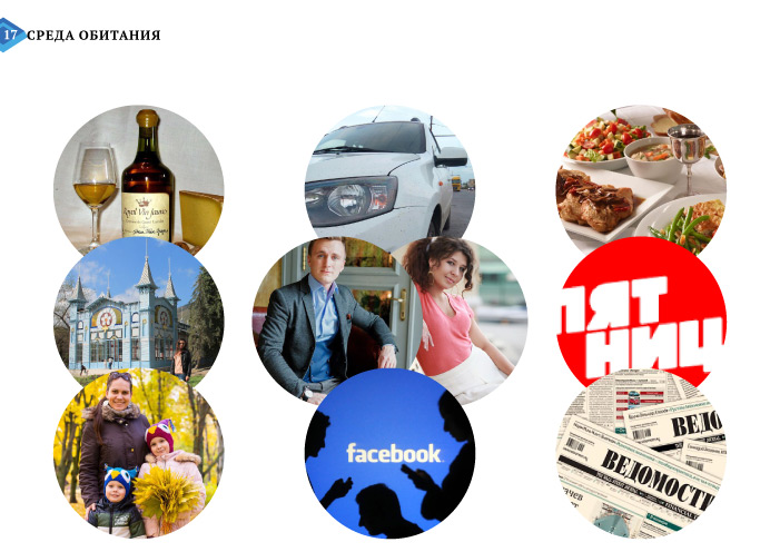
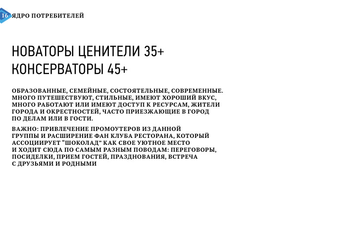
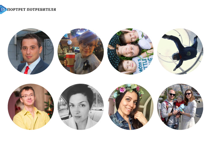
We have segmented consumers, studied their portrait and habitat, attributes and insights: they miss Europe and travel. Barriers: the logo refers to a candy store or Shokoladnitsa network, and there is a difficult entrance through the platform. The interior, dishes and service frighten by their high cost.
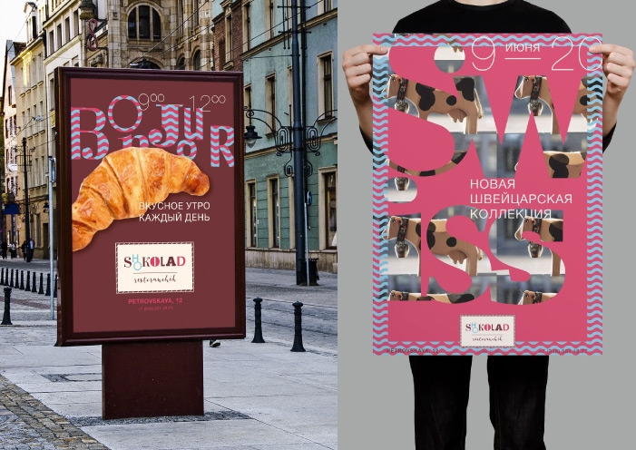
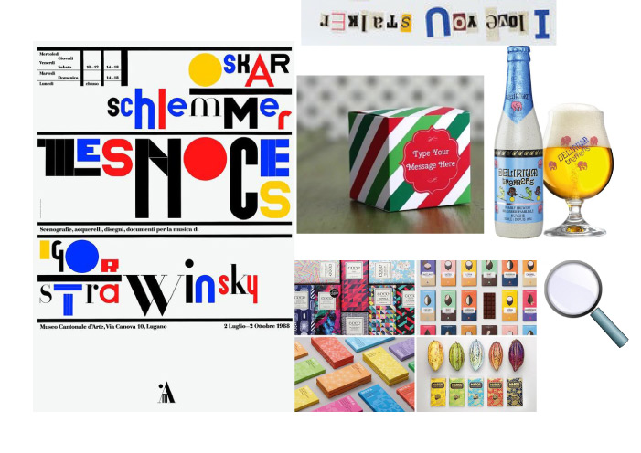
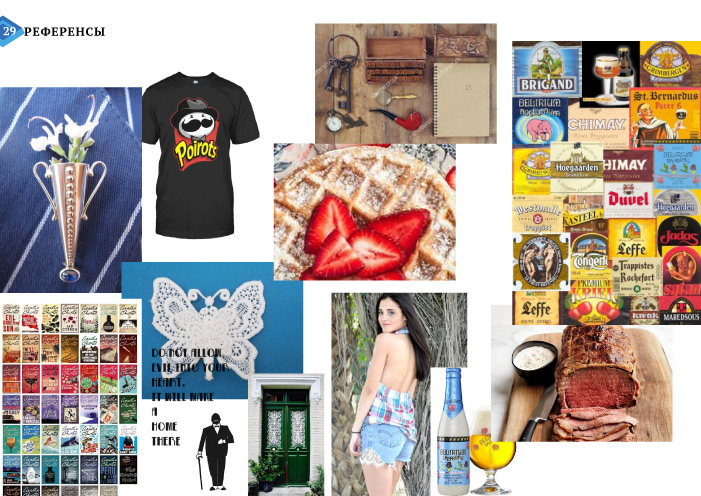
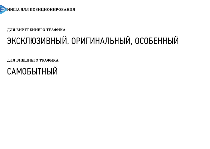
We have offered the concept of a European small restaurant of collections. The word "restoranchik" (i.e. a little restaurant) tells about seclusion, hospitality, and takes away from the subject of desserts. Collections reveal interest and match with love of travelling. We have chosen the character of the brand: hospitable, interesting, and cosmopolitan. We have picked up a design subject: Belgium, a cozy country of lace and chocolate as well as Hercule Poirot's homeland. The character and detectives are successfully combined with the character of the brand.
We have updated the name "Restoranchik Shokolad": the transcription emphasizes a local place, and the Latin sends to Europe. The uniqueness simplifies promotion of the website and protects the brand.
The basis of identity has been formed by lace, postcards and detectives. The cosmopolicity and hospitality have been communicated through familiar phrases in different languages. We have developed the content and design of the product and started an advertizing campaign.
We can completly research public catering buisiness, from idea to opening:
cafes, restaurants, bars.
leave a request
FMCG
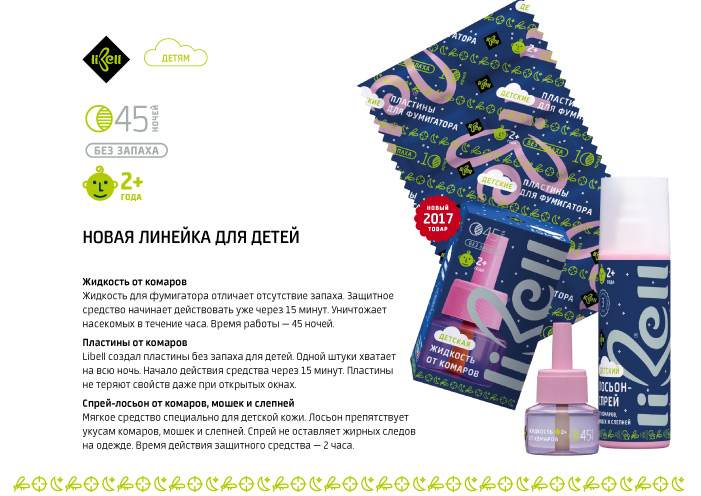
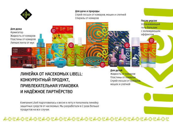
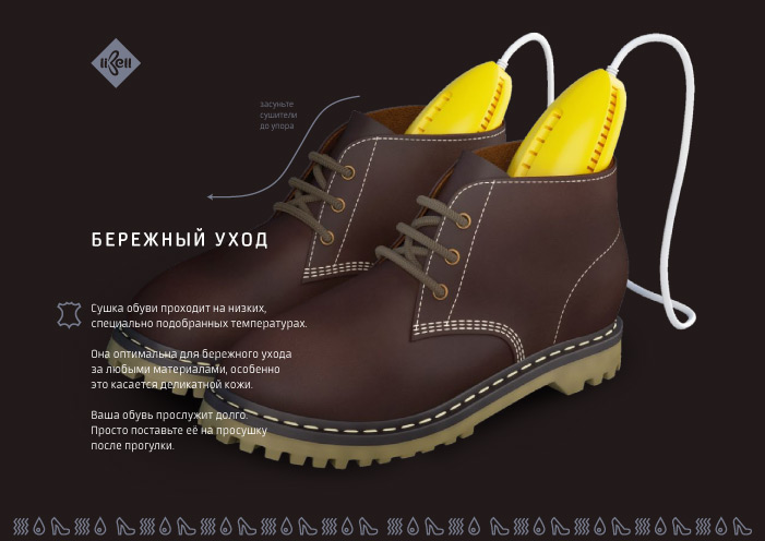
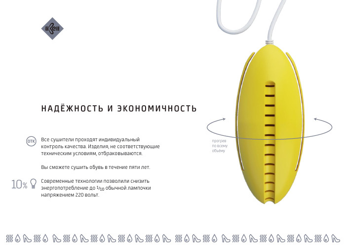
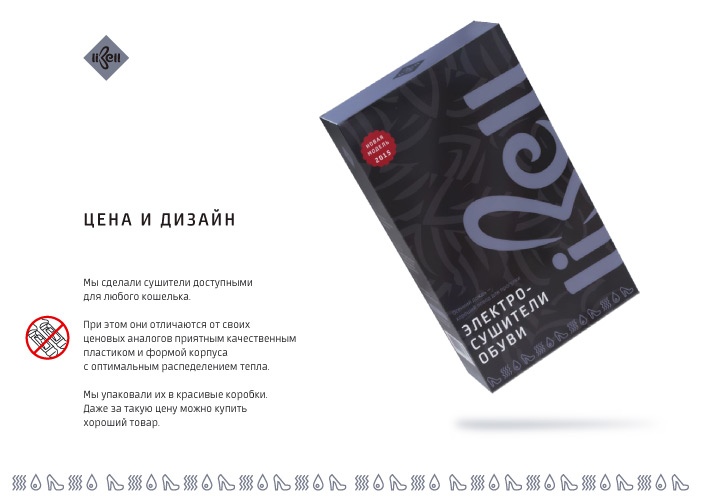
Libell
Task
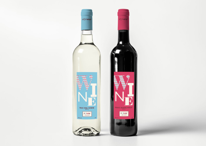
The company-distributor has entered the market with its own line of insecticides. In the competitive market, it has been required to develop a recognizable packaging and identity of products taking into account similar ones of other companies.
What Has Been Done
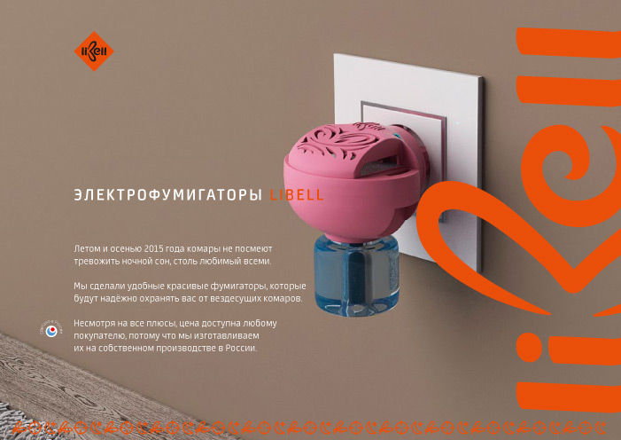
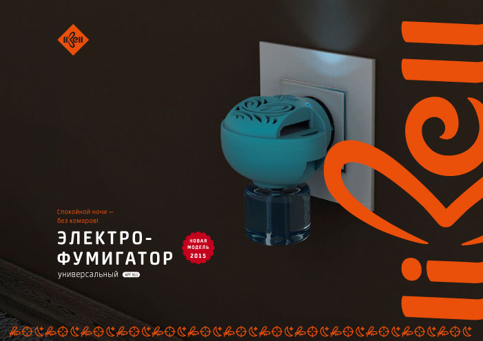
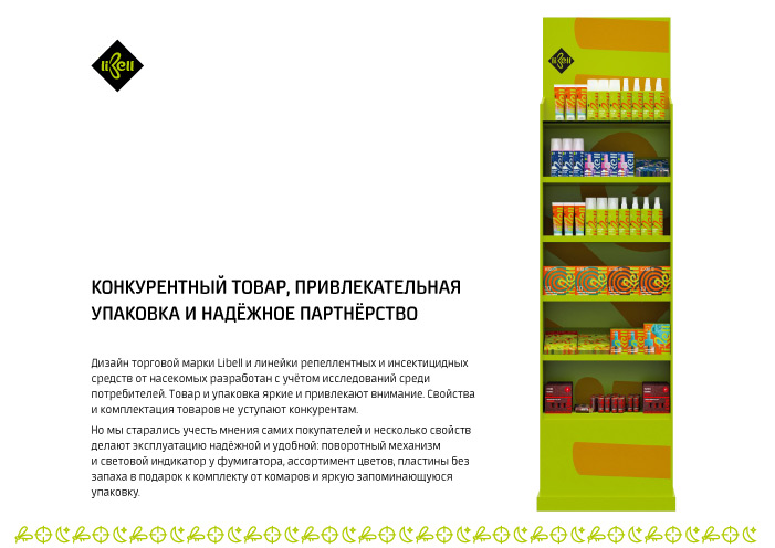
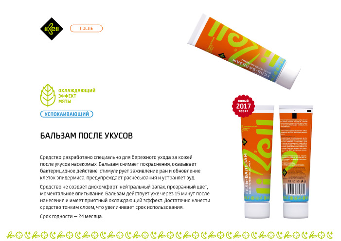
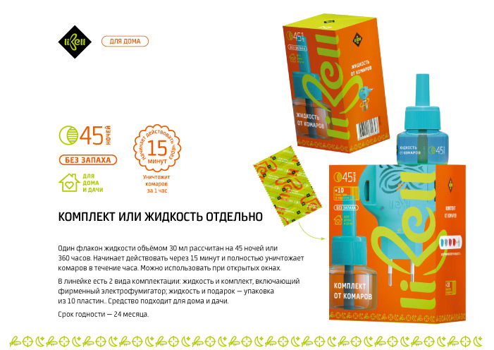
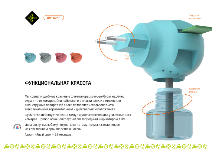
We have analysed the competitive market of household chemicals used against insects. We have revealed and systematized the created visual templates: colour schemes, forms, and sizes. The consumer research has been carried out, attributes, barriers and insights have been fixed. We have carried out a naming session, thought up and protected the name of the Libell trademark.
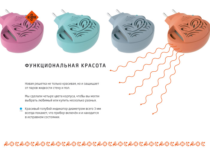
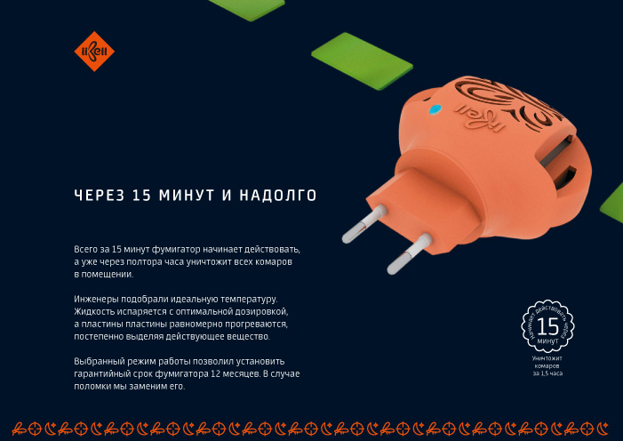
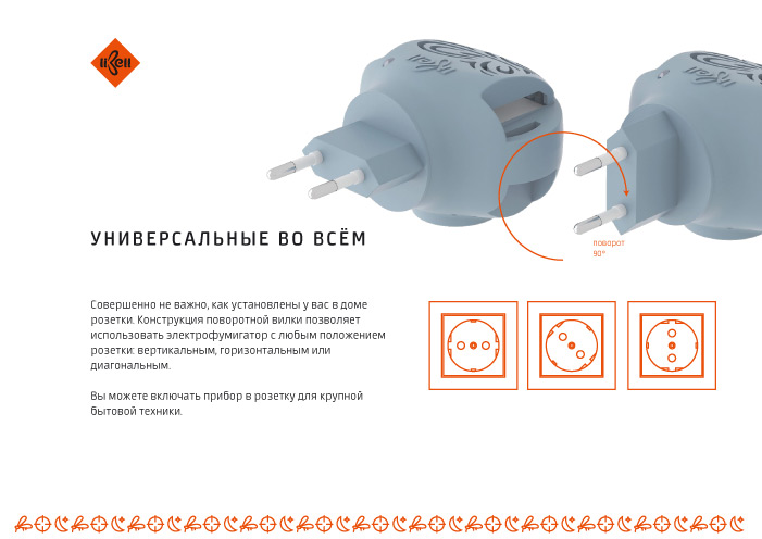
We have developed the sign and identity, prototypes of labels and packaging. Taking into account the opinions of consumers, we have designed the fumigant injector and put it into production. Furthermore, the whole line has been issued.


We make brands for FMCG:
all you need to be successful
in retail: from strategy to assortment and packaging.
leave a request
URBAN ENVIRONMENT
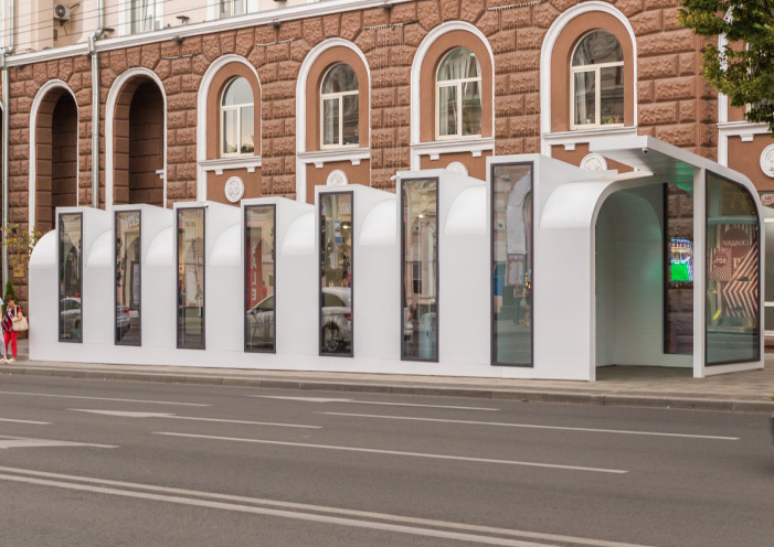
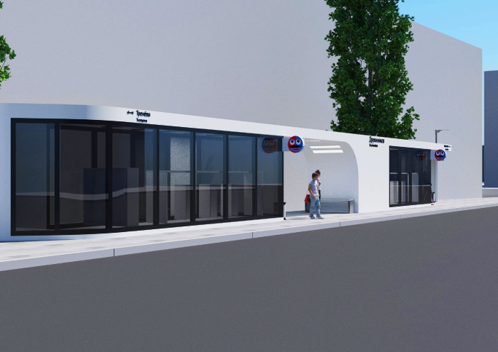
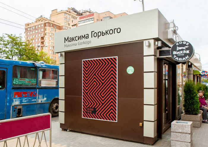
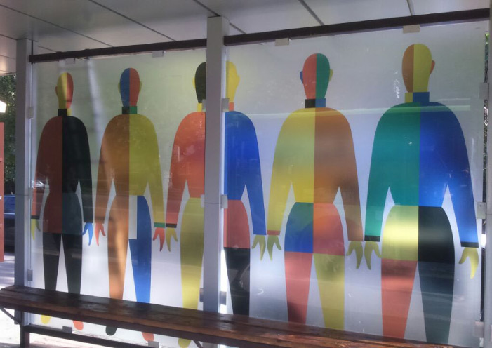
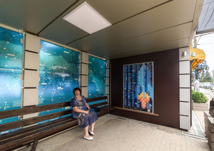
РУНИ
Task
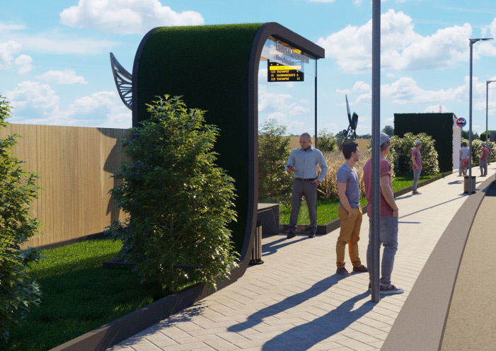
The company has several dozen trading and bus passenger shelters . It was required to bring everything to a single visual style, make them attractive and convenient for passengers demanded by potential tenants.
What Has Been Done
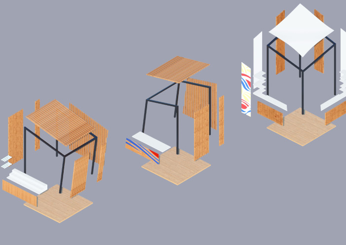
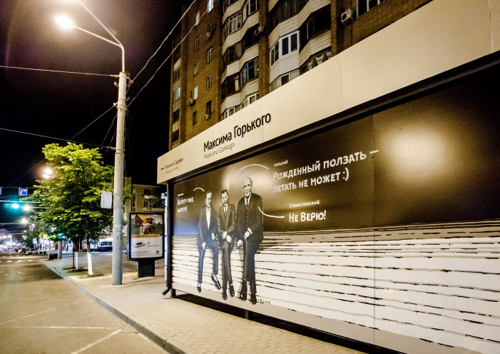
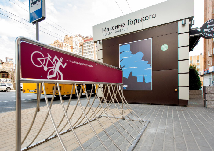
We have carried out the analysis of the passenger shelters accepted de facto as the standard in the city. Weak points at the level of development of a design have been revealed: the pavilions were built inconveniently both for lessees and citizens, there was no space either for the schedule or commercial signs.
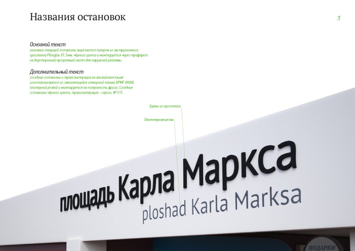
We have used the rules of a design code of the world capitals as the basis for this architectural designing. We have developed single standards of placement of texts, signs, advertizing and navigation. Stopping complexes have got rid of information noise, taken an accurate form, as well as improved the cityscape.
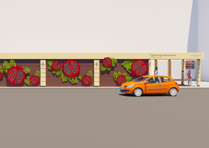
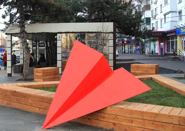
In parallel with the reconstruction, the project "Available Literature' has been realized, i.e. decoration of bus stops with introduction of the texts, verses and short stories of the writers somehow connected with a certain residential district or street of the city. Besides, we have tried to make each complex dissimilar to others by decorating it with thematic drawings.
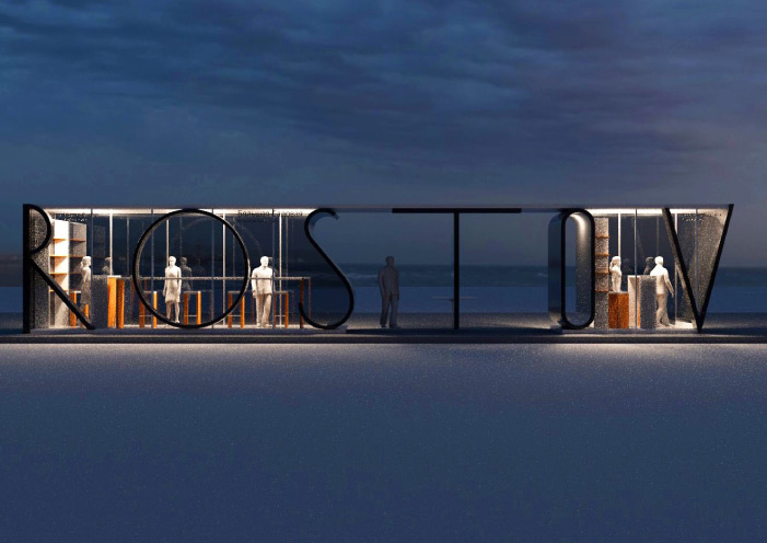
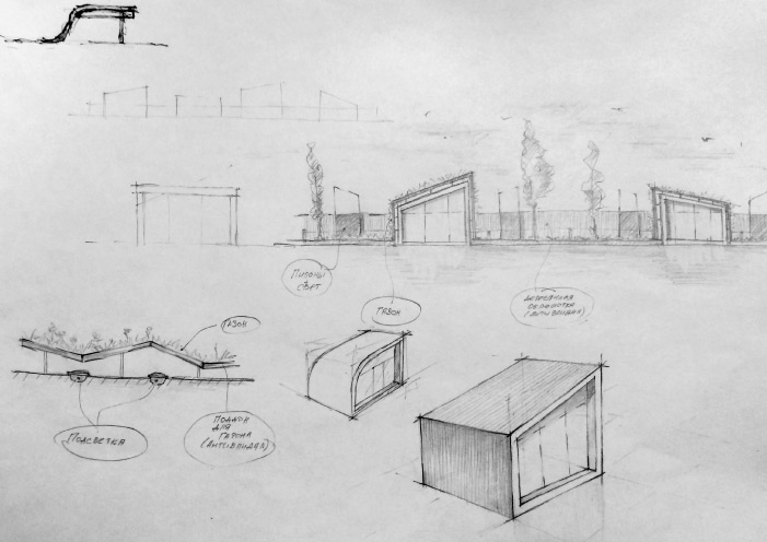
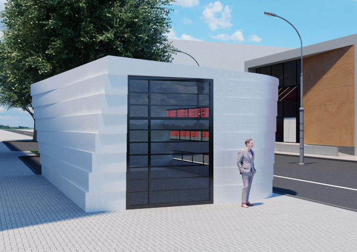
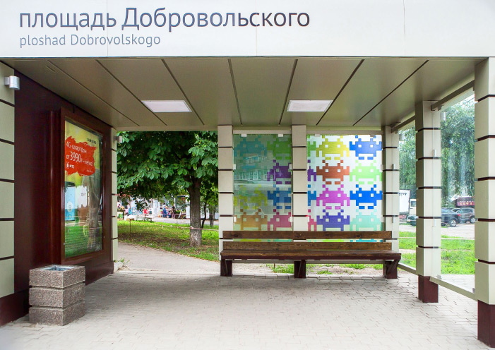
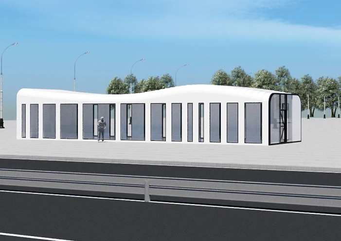
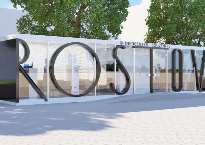
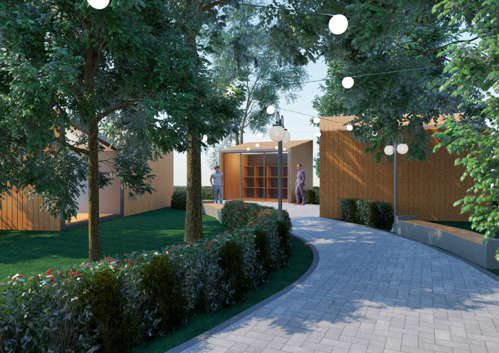
We have designed a number of unique non-stationary objects as future sights, for example, a transparent pavilion in Bolshaya Sadovaya Street, the pavilion-wave at the entrance of the city and the pavilion 'Rostov' in Voroshilovsky Avenue.
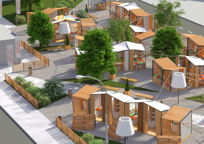
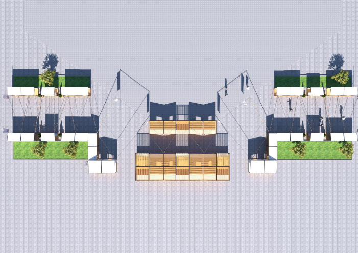
We have developed and implemented the concept of a city fair which is able to become the city standard. The thought-over design, sound materials, metal and wood have given a new quality to the ordinary type of trade. The fair has stopped looking like the market.
WE DEVELOP PUBLIC SPACES:
SMALL ARCHITECTURAL FORMS, LANDSCAPE,
NONSTATIONARY TRADE OBJECTS, TRANSPORT KNOTS.
leave a request
FAST FOOD
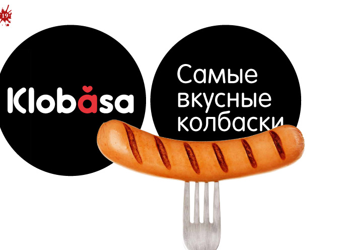
klobása
Task
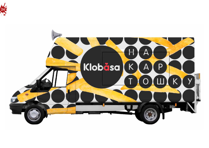
Enter the fast food market. Check the profitability hypothesis of a foodtrak network with hot dogs and the possibility of extending the menu with shawarma and donuts. Vans as a replacement for a non-stationary outlet. It is convenient to work on the road - at a fair or festival.
What Has Been Done
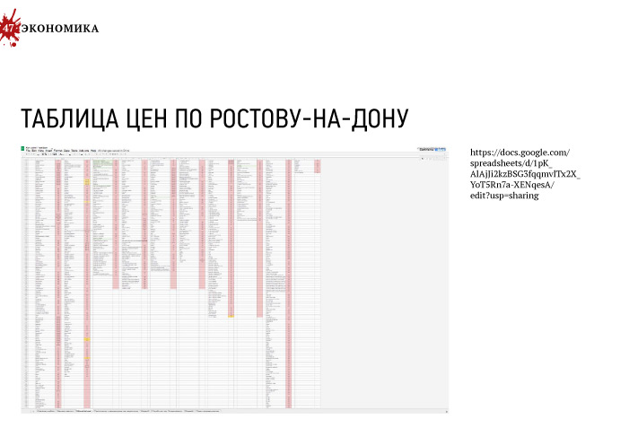
We have studied fast food trends in Russia, dealt in details with prices and competitors in Rostov-on-Don. We have drawn a conclusion on unprofitability of the initial hypothesis on trading ordinary hot dogs.
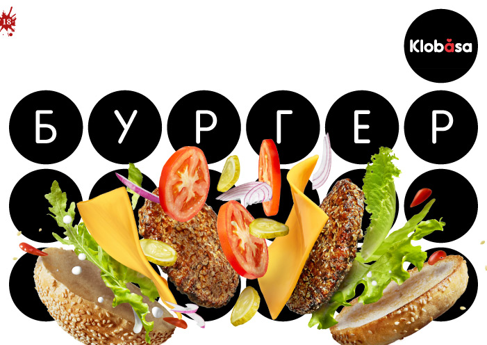
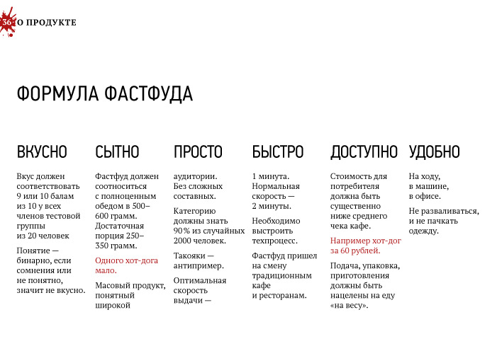
We have suggested to occupy a less competitive niche without changing the general direction: to use wurst as a monoproduct in different servings instead of sausage. It is tastier, the cheque is larger. In such case, market capacity is enough to achieve the business objectives.
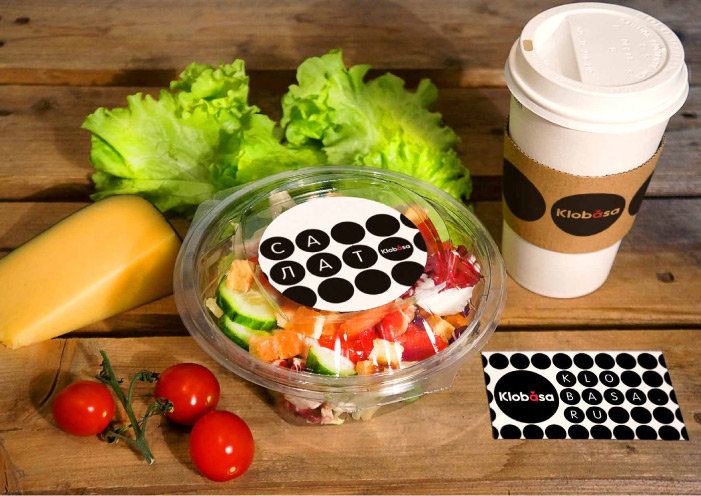
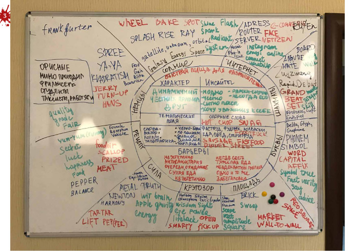
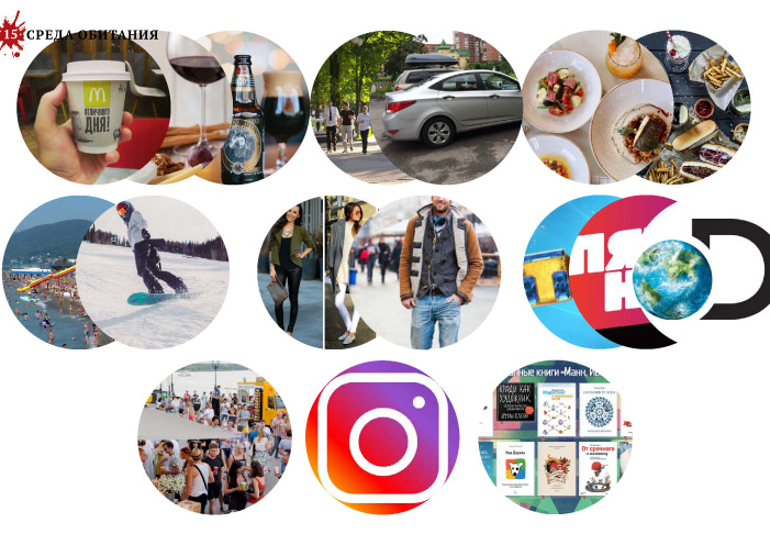
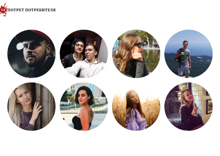
We have segmented consumers, collected attributes, barriers, and insights. The product should always be tasty, nourishing and convenient in use. Our buyer is a thinking person, he is ready to pay for fair food and quality. Together with a purchase, he gets a card-wish with a motivating quote.
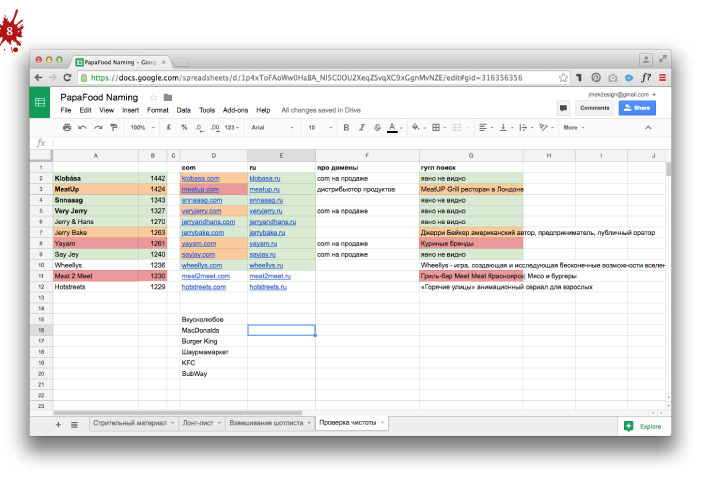
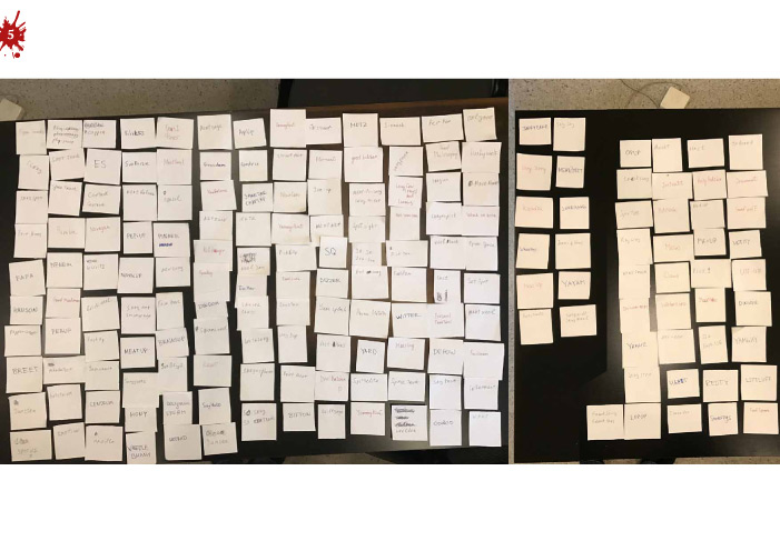
We have removed the nature of the brand: dynamic, friendly, and fair. As a result of the naming session, the name "Klobása" appeared which reflects the essence of the product.
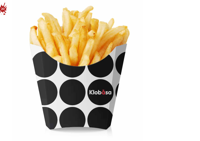
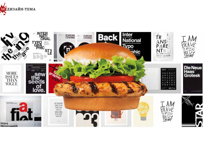
The black-and-white design-subject reflects strictness of the rules which are followed when hot dogs are made. The circles, built in an ideal grid, remind of the German order. Words and letters in circles form a crossword puzzle, emphasizing the intelligence of the consumer.
We have developed a packaging of the product and drinks, design of advertizing materials, and arranged a sales point and templates of social networks.

WE DEVELOP THE CONCEPT OF FAST FOOD NETWORKS:
SEARCH PRODUCT NICHES, BUSINESS MODELS,
COMMUNICATION STRATEGY, DESIGN.
leave a request
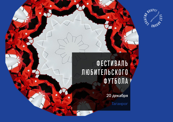
TERRITORIAL BRANDING
Fest Around
Task
An organization has been created in the Rostov Region to host guests of the World Cup 2018 in football. It was necessary to create a unique brand and positioning, conveying the character of the territory. Develop promotional materials for tourists and partners.
What Has Been Done
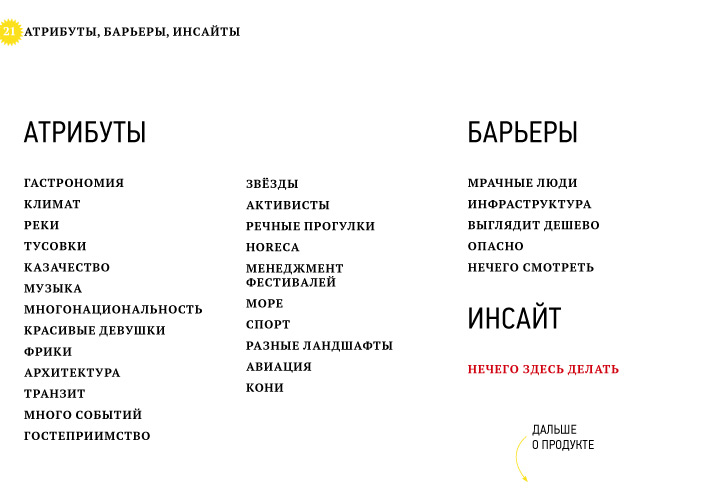
We have studied the Rostov region from the point of view of perception by current and potential tourists, and analyzed tourist projects. We have segmented consumers, studied their portrait and habitat. The climate, cuisine, and hospitality are nice. Barriers: gloomy people and bad infrastructure. We have revealed the insight: there is nothing to do here.
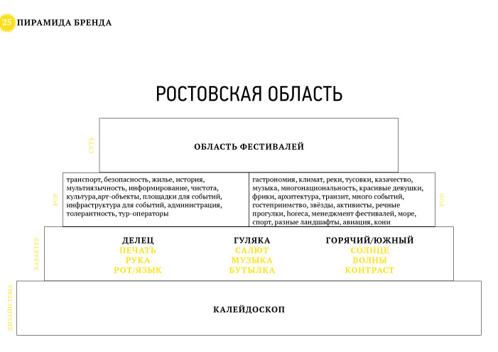
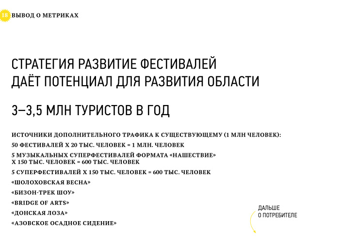
We have created the offer on positioning: an area of festivals. The territory of fests and concerts, meetings of enthusiasts and big fairs for the sake of participation in which there is a common sense to arrive to the Rostov region for several days.
The character of the brand is a hot southern idler, but at the same time a prudent businessman / merchant. Rostovites are hospitable and good at fun, remember about their benefit at the same time.
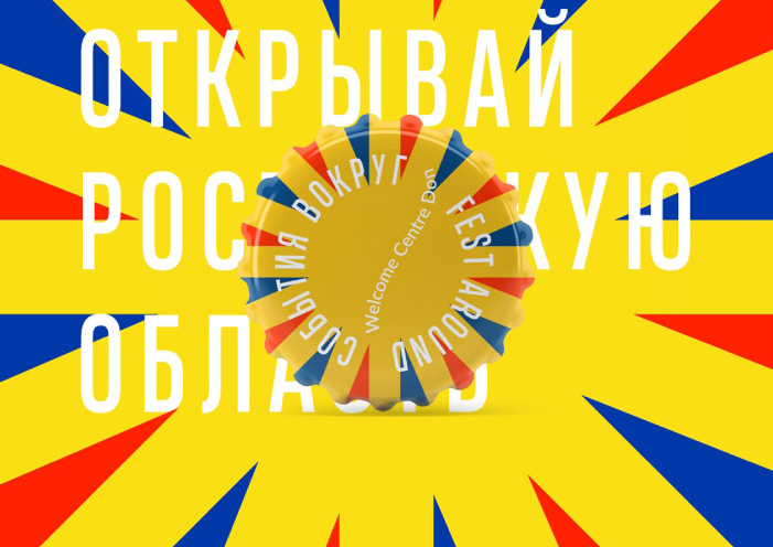
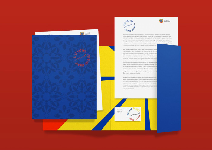
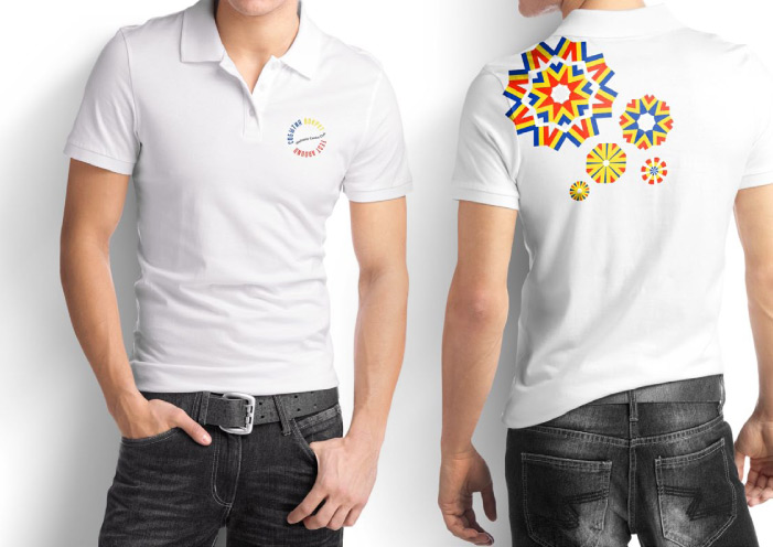
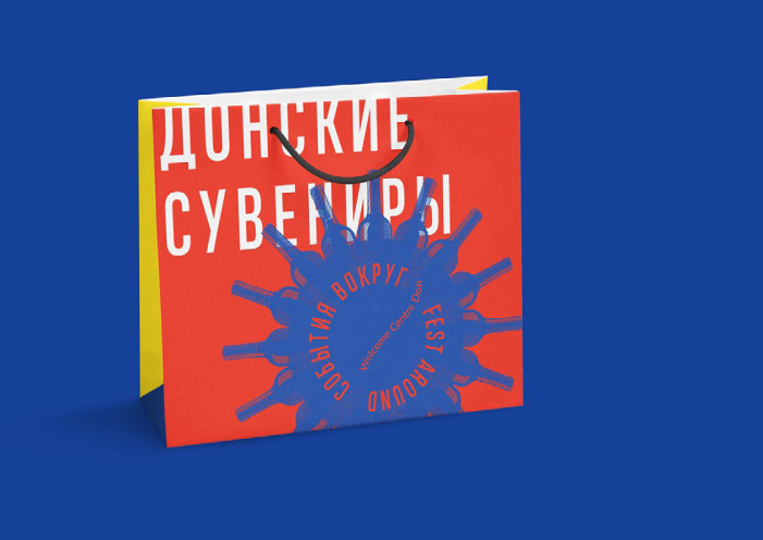
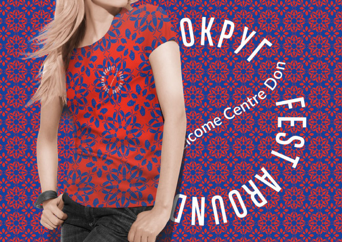
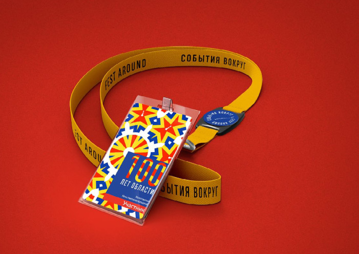
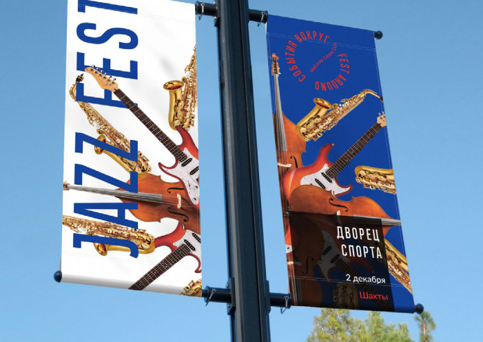
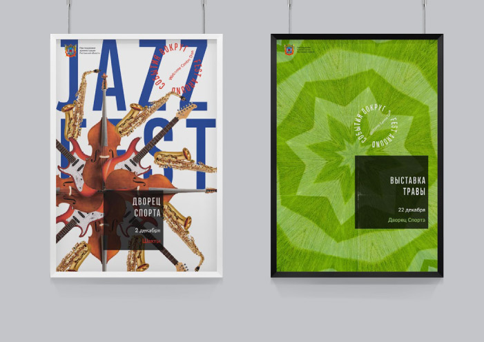
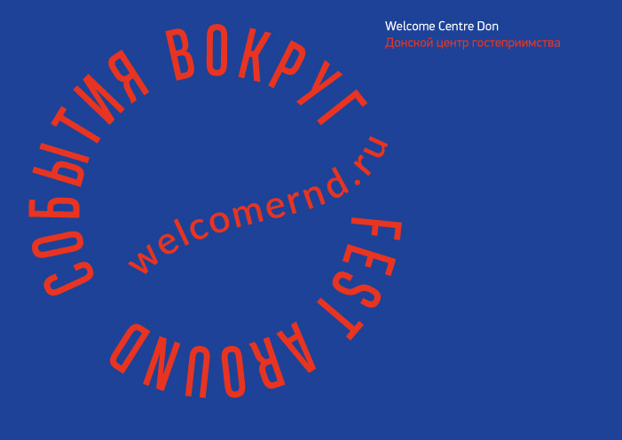
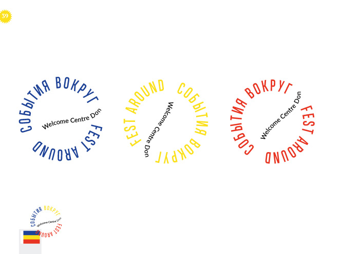
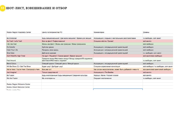
We have correctly translated the name "Tsentr Gostepriimstva" (i.e. "Centre of Hospitality") into English as "Welcome Center Don", and made up Fest Around descriptor (the Russian variant: "Sobytiya Vokrug").
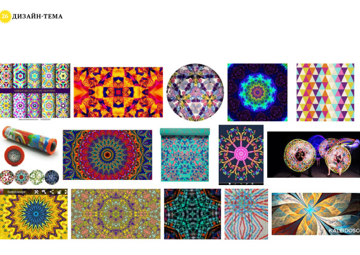
The design subject which has been the basis for the identity is a kaleidoscope, continuous change of bright impressions-pictures which will nevermore repeat, patterns in colours of the Rostov region flag. The sign in the form of the stylized seal refers to the Rostov merchants and official status of the centre.
We have developed the content and design of advertisement and souvenirs. We have issued a tourist map of Rostov-on-Don to World Cup-2018.
WE ENGAGED BY TERRITORIAL BRANDING:
DEVELOP A CONCEPT
AND REGIONAL DEVELOPMENT STRATEGIES.
leave a request
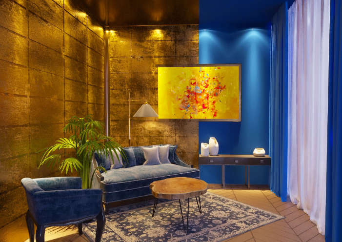
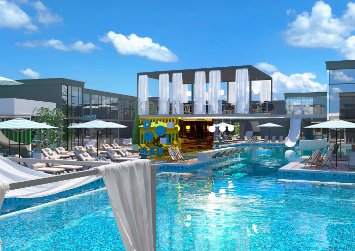
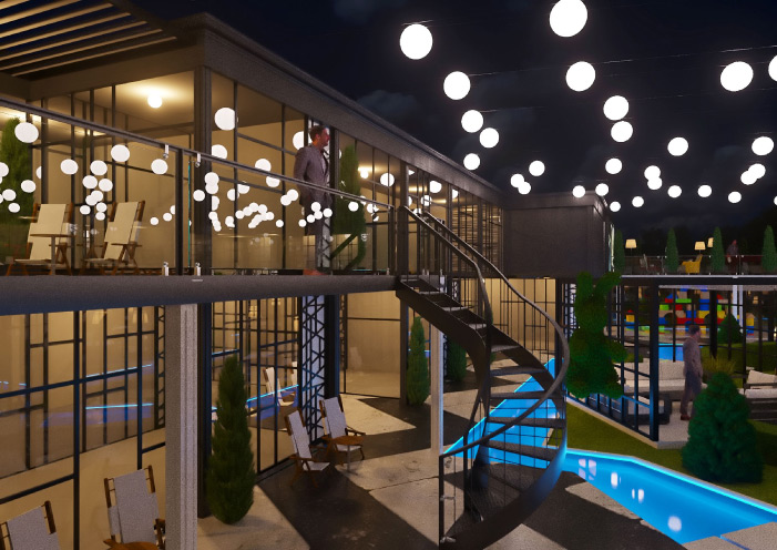
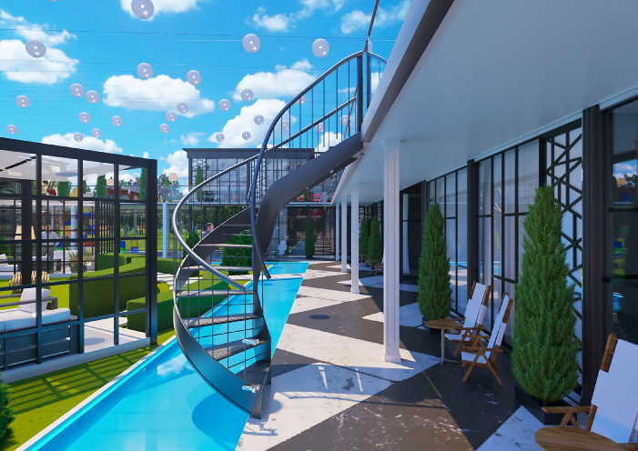
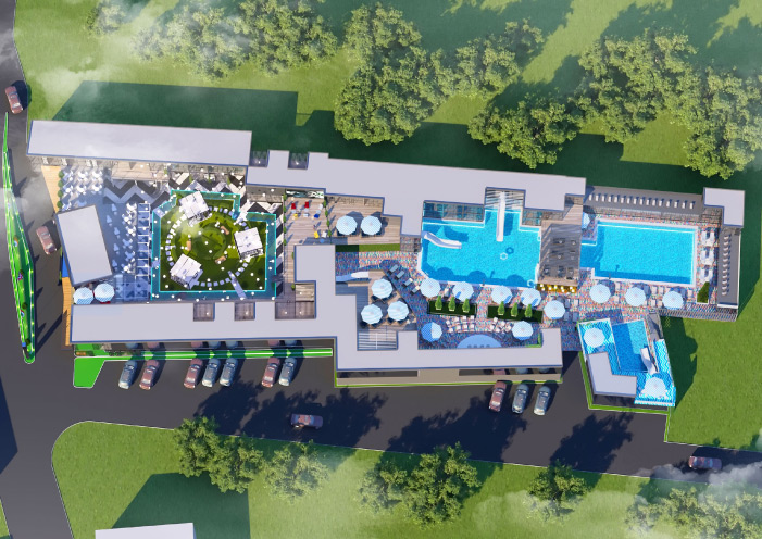
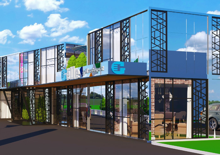
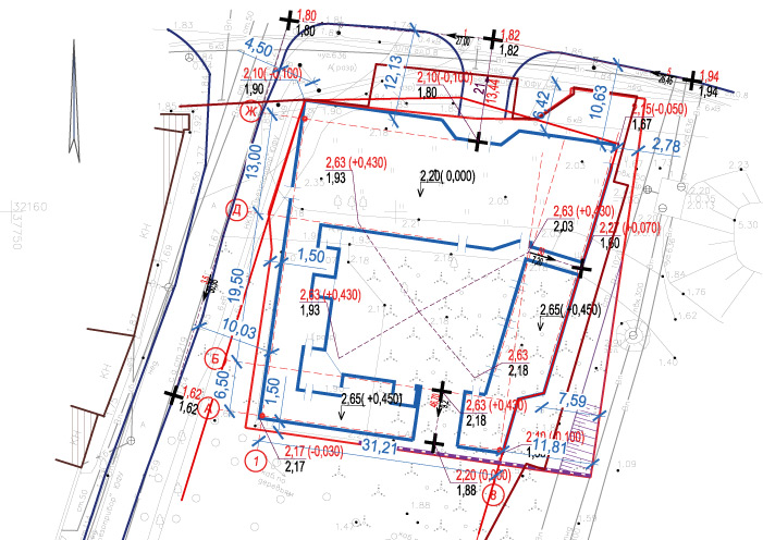
COMMERCIAL REAL ESTATE
Delviq
Task
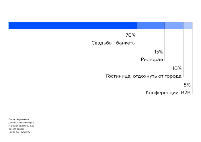
To build a successful year-round hotel on the left bank of the river Don with strong and various gastronomy both for Rostovites and tourists. To offer a strong concept which will beat the competition in the market of restaurants, mini-hotels and complexes of recreation.
What Has Been Done
The market research has shown that there is no external tourist traffic but only a business one in Rostov-on-Don. At the same time, the market capacity is sufficient for a high-quality offer of a premium segment. We have drawn positioning from the consumer analytics: a teleport of successful people into a hedonic history.
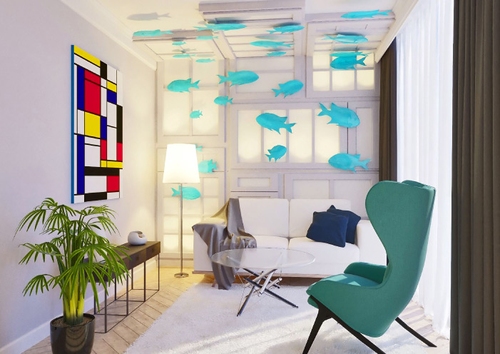
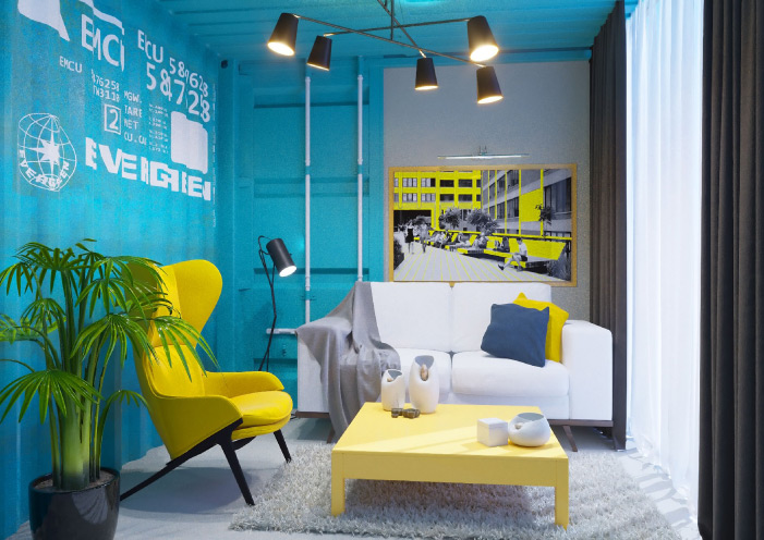
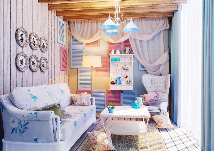
We have thought up the name for the hotel, "Delviq". We have developed architectural sketches of the territory and building. The interior of each hotel accommodation has been designed in a unique style in order to have an opportunity to return there lots of times and never repeat.

WE MAKE CONCEPTS AND DESIGN PROJECTS
FOR COMMERCIAL REAL ESTATE:
HOTELS, SHOPPING CENTERS, SHOPS.
leave a request
EVENTS AND TRADE
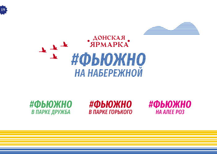
#FYUZHNO
Task
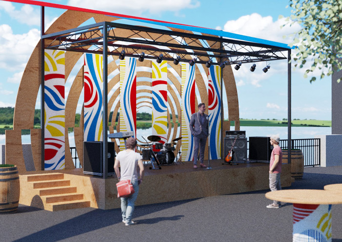
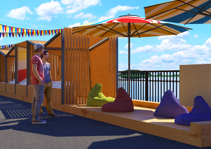
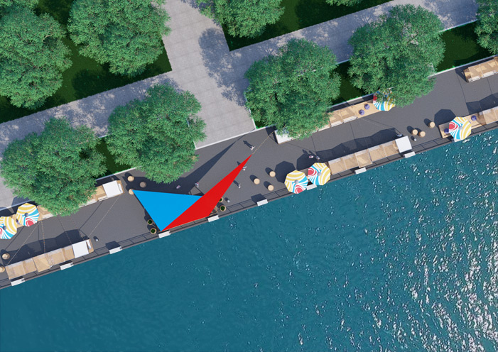
The company received a part of the embankment for rent, with the condition of the location of the weekend fair on it. It is necessary to develop a concept, zone a territory, design trade pavilions and launch a city fair.
What Has Been Done
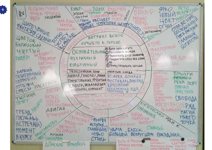
We have studied both international and Russian experience of holding fairs. We have offered the concept of a fair festival, carried out the analysis of competitors, and estimated market shares.
We have segmented consumers of B2B and B2C. WE have determined values, found out barriers and insights, constituted portraits and the habitat. Attributes: cultural rest, concerts and events every weekend, interesting goods, the best street food.
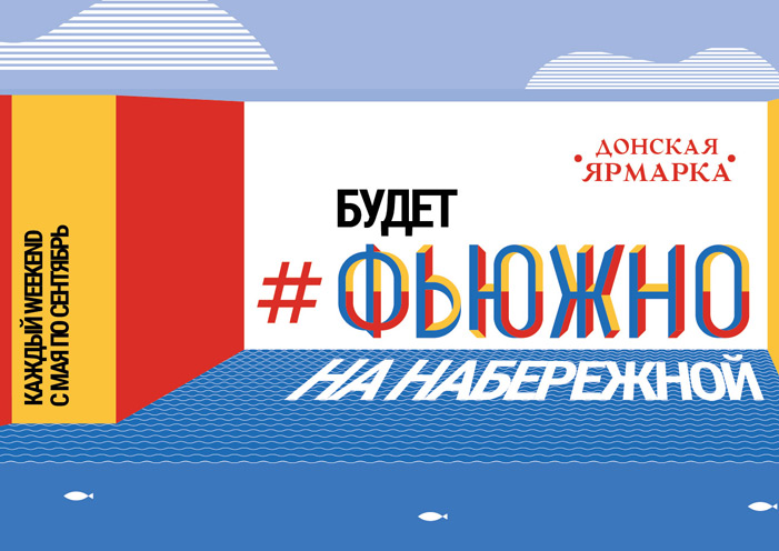
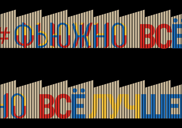
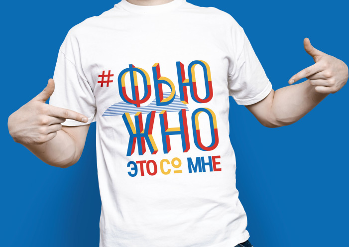
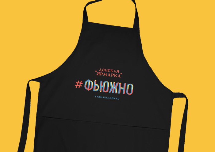
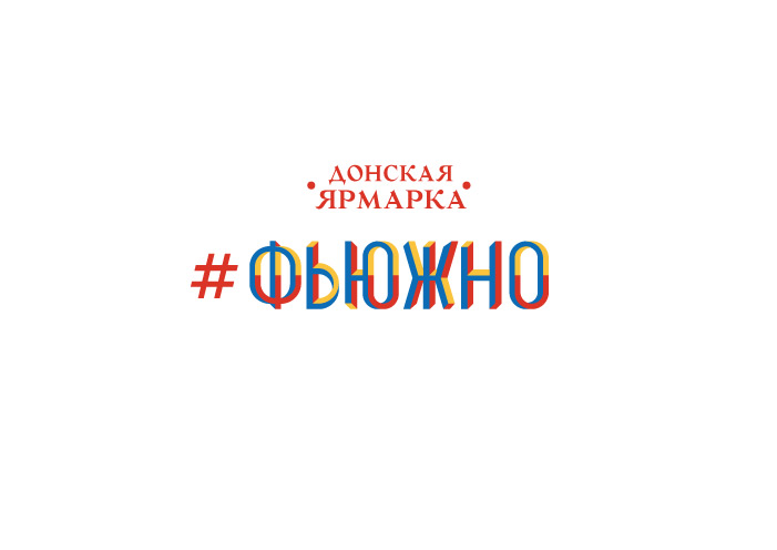
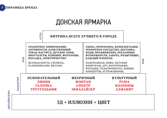
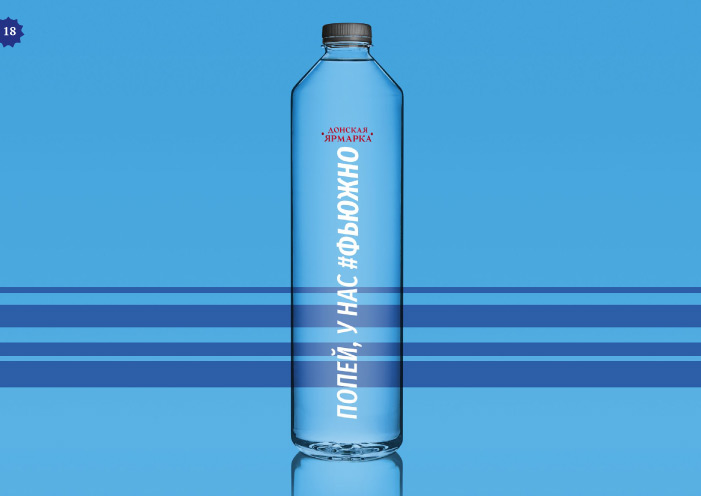
We have made a value proposition and a business model of a fair. We have carried out a naming session, thought up the name "#FYUZHNO" ("#ФЬЮЖНО").
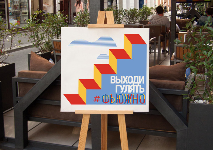
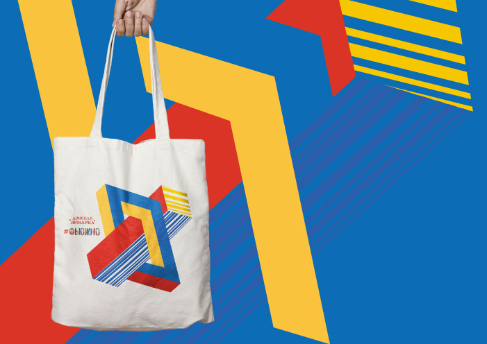
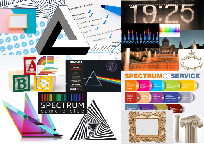
WE have constructed a brand pyramid, whose essence is: show-window of all of the best in the city. We have chosen the nature of the brand: thorough, cultural, and fabulous. The design subject is an optical illusion as a symbol of that the fair in every sense is much bigger, than it seems at first sight.
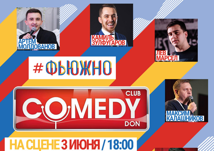
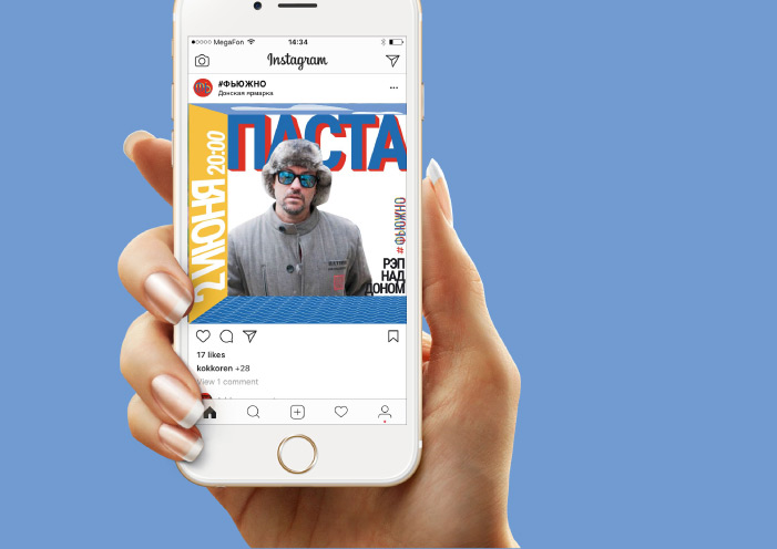
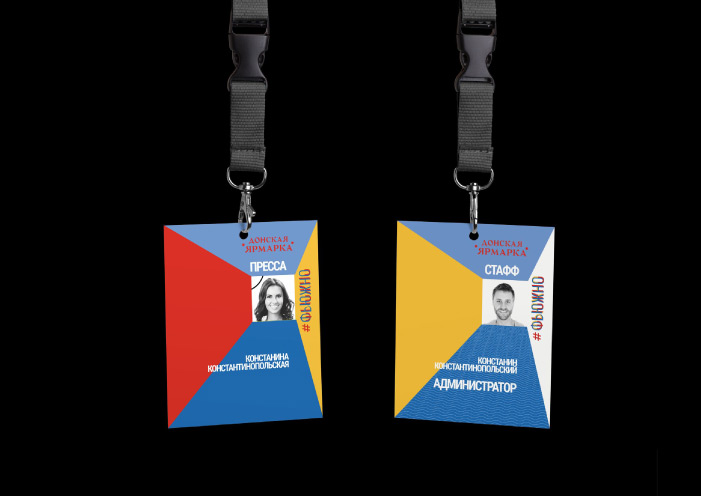
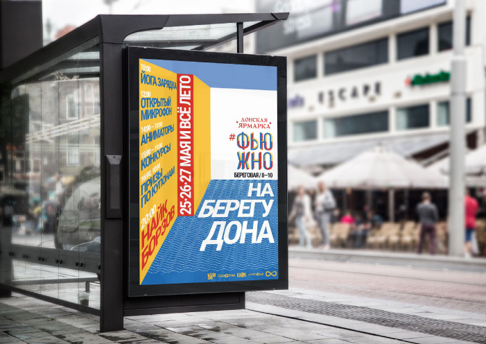
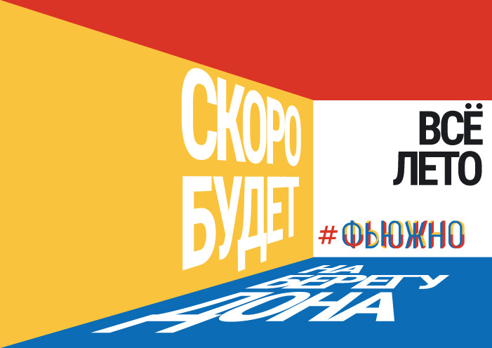
We have designed trade pavilions and a stage. We have developed a communication strategy and promotional materials. We have started an advertizing campaign.
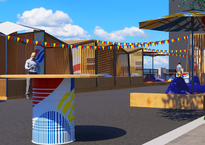

WE MAKE EVENT BRANDING, CONCEPT
FAIRS, FESTIVALS, HOLIDAYS:
RULES OF DECOR, ADVERTISING CAMPAIGNS.
leave a request
JMEK DESIGNBRANDING AGENCY
WE CREATE STRONG BRANDS
We work in ROSTOV-ON-DON, Moscow, Krasnodar, Slovakia, Montenegro, UK, Romania, Georgia, Israel
office in the center of Rostov-on-Don, Gorky 67, right in the arch
share with friends
Maybe they need
to make thir business better


© 2018 JMEK DESIGN LOVES YOU